IBM Watson
The challenge
Redesign the Watson training experience.
The scope
Two weeks, 10 junior software product designers.
My role: UX design
I worked in a team of researchers, UX, visual and prototype designers. As the UX/UI designer, I produced wireframes based on the research findings and solved complex interaction problems. I also participated in research, ideation and expert interviews with data scientist, machine learning experts.
What I learned
IBM Design Thinking
Design for the end user
How to communicate with subject matter experts
How to make decisions based on research and assumptions
Understanding Watson
The problem
When training Watson, how to increase Watson’s accuracy faster?
Watson has a corpus, containing documents of a particular subject. For example, the version of Watson developed for Jeopardy! contained the full text of wikipedia, which has millions of pages of content! Before Watson can understand the clue and give the most probable responses, Watson needs to be trained by subject matter experts.
Design process
Empathy
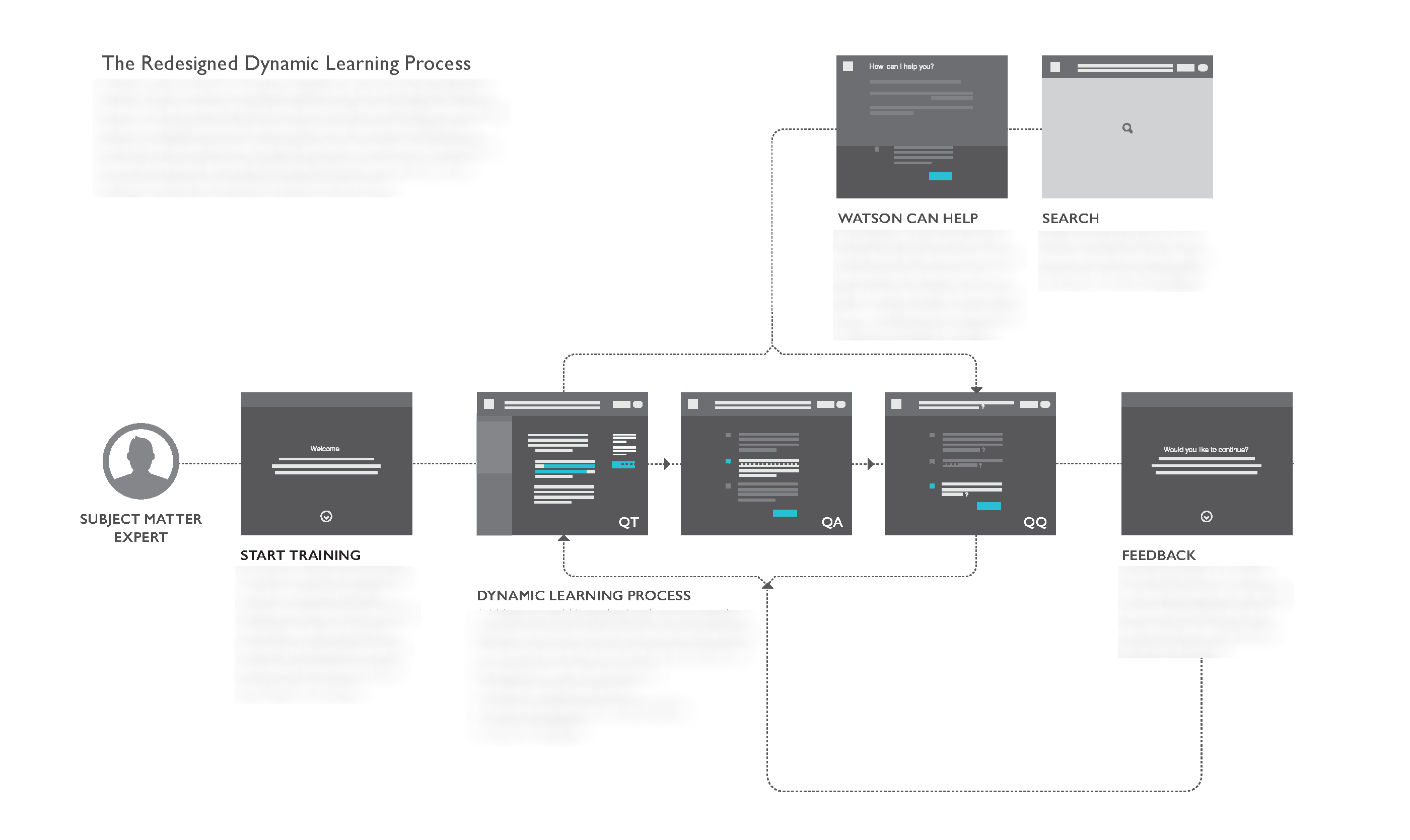
Watson “learns” in three ways:
1. composing an answer with information in the documents(QT)
2. pairing a question with an existing answer (QA)
3. linking the question with another question (QQ)
All three of the question answering tasks require the experts to find or compose the answer using words or sentences from the documents in the corpus. As the result, the training process is rather long and painful - imaging the experts sitting in front of computers for 8 hours a day, looking through pages after pages of documents, trying to find answers for questions.
Assumption
After interviewing data scientists and machine learning experts, the researchers in our team concluded that the current technology limitations impaired the user experience. As a team, we decided to pursue what’s better, not what’s technically possible. Two major assumptions were made which led to the solution we proposed:
1. Some questions are better
2. QQ pairing is more effective

New workflow
After understanding how Watson works, we began with the ideation process. As a team, we created two personas and built empathy maps and journey maps around them. As one of the UX designer, I focused on three design opportunities and crafted a new workflow.
1. Better ways to organize and display information.
2. Give users timely feedback.
3. The user should only do one thing at a time

The result
The design received great feedback from stakeholders, and it provided the current product team with a long runway. Under NDA, I'm not able to show you the beautiful UI we designed for Watson Tooling. I would love to connect if you have questions or want to talk about the Watson project.

What I learned
Make wild assumptions!
This was one of the most difficult projects I worked on. The reality is that Watson is still in its early stage. There’re things I don’t know nor fully comprehend. I did my best to understand pages of technical documentations and see beyond the limitations. Every groundbreaking innovation was once impossible. I made wild assumptions and designed for the user. Through this experience, I learned a valuable lesson—don’t stop exploring good ideas even if it is still technically impossible.